Ideate, Create, Adapt

An Approach to the Challenge of Branding
Branding is one of the most essential aspects of the advertising, marketing and public relations fields. However, for as frequently as the word “branding” is used by professionals in these industries, it is one of the most commonly misunderstood terms. Many mistakenly believe that the process of developing a brand is as simple as designing a logo and pairing it with fonts and colors. While an effective and appropriate logo is an essential piece of creating a brand, a logo alone cannot address all of a brand’s needs and completely tell the brand’s story. Branding is more than just a logo design. Branding is better than just a logo design. In fact, the process of creating a successful brand should start before the logo is ever concepted.
Before a brand seeks to have a logo designed, they should take into consideration the ancient Greek aphorism, “Know thyself.” All successful brands are aware of and deeply believe in their own, unique identity. They can confidently define their purpose, intended audience and value proposition. Successful brands know why they exist, whom they exist for, and what makes them better than their competition. One name for this prenatal process of defining a brand’s identity and purpose is ideation.
Campesino Rum is one of the many clients that Telegraph assisted in the ideation phase of creating their brand. Central to Campesino’s identity as a brand is the question, “What is Rum?” Campesino believes that rum is more than just a liquor produced from fermented sugar cane; rum should be an experience rooted in history, adventure, craftsmanship and culture. Because Campesino believes that rum is more than just a beverage, their identity as a brand must set them apart from competitors in their industry. That is why we approached Campesino’s brand with a thoughtful, detail-oriented approach that reflects the individuality and authenticity of Campesino’s conviction. For example, all of the photos we use in Campesino’s website or social media are less stylized and more organic; they focus on real moments that imply exploration and adventure in the Panamanian jungle.


Campesino’s unique identity is also conveyed through their website design. Instead of being bombarded with a product, users visiting Campesino’s website will be met with a highly engaging, interactive digital experience. With features like an “animal spirits” personality test and specialty drink recipes, visitors are visually transported into the very jungles that inspired the brand. This commitment to creating a unique, organic experience is how Campesino Rum successfully defined itself during the ideation phase of brand creation. While the ideation phase is extremely important for the success and longevity of a brand, no brand can come to life without the creation phase.
When most individuals hear the term “branding,” they are specifically thinking of the creation phase: a small part of the larger task that is branding. The creation phase involves the designing of the logo, website, physical collateral pieces, social media and all other visual assets that a brand may need. In the creation of these assets, the purpose and identity that were defined during the ideation phase are made visual.
Designing the logo is the central visual challenge involved in the creation phase of the branding process. The logo should function as a symbol for the brand and its message; it is effectively “the face” of a brand. However, it is important to remember that a logo cannot possibly meet all of a brand’s needs alone. In a way, a logo functions as an empty vessel. That is to say, it cannot generate meaning that was not defined during the ideation phase, and it also cannot function correctly unless it acts consistently with the identity and purpose of the brand. The identity and purpose of a brand must permeate all of the brand’s visuals, not just the logo. A great example of this branding consistency can be seen in another one of our clients, Born Ready.
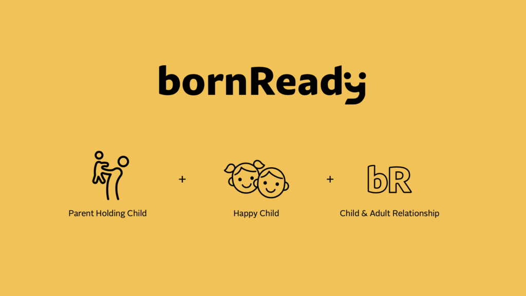
Born Ready is an initiative from the Alabama Department of Early Childhood Education focused on raising awareness of the importance of early brain development and the empowerment of parents to play an active role in their child’s life. Their logo is a symbolic wordmark with tri-fold meaning: It symbolizes the parent-child relationship, smiling children, and a parent holding their child. However, even if a viewer could not immediately recognize all three of those abstract meanings, they would unmistakably sense that the logo is friendly, warm, affirming and welcoming. The fact that these affirming qualities are immediately recognizable to viewers proves that the logo is congruent with the brand messaging, which supports parents by reminding them that they were “born ready” for the admirable responsibility of parenthood.
The encouragement that Born Ready seeks to provide parents is incorporated in elements beyond the logo. Born Ready’s content is paired with whimsical face icons that mimic various expressions of a child; hand-drawn markings in vibrant, pastel colors; and photos that show parents and caregivers interacting with children in meaningful ways. All of these elements of the brand further the precedent that was defined in the ideation phase and made visual with the creation of the logo. The fact that Born Ready’s logo and content match the defined mission and purpose of the brand reveals that Born Ready is a brand prepared for success. However, even brands that have been successful in the ideation and creation phases of branding know that one more phase exists for brands that desire longevity—an intimate, authentic connection with their audience.
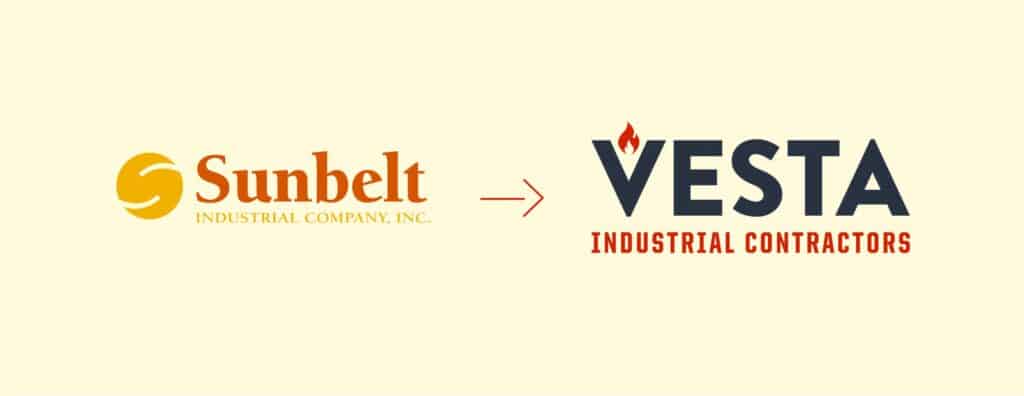
Successful brands know when it is time for a change. One of our clients, Vesta Industrial Contractors, illustrates this crucial principle of brand adaptation. Founded in 1993 as Sunbelt Industrial Company, the brand prides itself on the reliability, thoroughness and thoughtfulness that it brings to the industrial insulation market around the Southeast. While Sunbelt’s business practices embodied all of the characteristics that were essential to their identity as a brand, they needed a visual identity that was congruent with their excellence and would resonate with their contemporary audience. In 2019, Sunbelt became Vesta Industrial Contractors and was given a new name, logo and identity system. The new name and identity system not only embrace modernity, but better represent the true, original values of the brand. The warm, muted colors represented the brand’s commitment to the craft of industrial insulation, and the grey colors and sturdy typefaces imply Vesta’s unparalleled reliability. When Sunbelt became Vesta, they were not selling out or turning their backs on tradition; they were actually re-engaging with their original purpose as a brand. With this change, Vesta exemplified that oftentimes change is inevitable and necessary, even for the most established brands.
Like our clients Campesino Rum, Born Ready and Vesta Industrial Contractors, all successful brands must recognize that the task of branding is complex and requires a great deal of thoughtfulness. Although the process of branding is a high-maintenance and constantly evolving task, we believe that having a deep awareness of the problem at hand is the first step to solving it. Knowing and practicing the phases of ideation, creation and adaptation are the first steps to creating authentic and enduring excellence for your brand.